
5 Favorite Lightroom Hacks and Tips
Lightroom is a killer program that combines photo organization tools with raw development tools. And while it’s generally easy and intuitive to use there are
 Skip to content
 Lightroom is a killer program that combines photo organization tools with raw development tools. And while it’s generally easy and intuitive to use there are

In this Lightroom workflow tutorial learn how to beautifully develop your landscape photos in less than 10 minutes. Learn to effectively use the tone curve,

Lightroom CC (and ACR CC) now have the ability to create raw panoramas directly in the program. The resulting panoramas are DNG files and are

Struggling to remember all those awesome Lightroom keyboard shortcuts? Here’s an easy trick to display all your favorite shortcuts in the Develop Module:

Hey photographers, did you know you could turn a series of photos into a simulated long exposure? A while back I created this tutorial about how

Hey photo dudes and dudettes, when I was recording a video about how to use Photoshop to turn a bunch of back to back to back

Want to learn how to add sweet rays to your photos? here’s how… This technique will work for a lot of images but the best

Post-processing is an integral part of photography these days but it’s all too common in this digital era to see photos pushed past their breaking

If you are looking to defeat image pirates or see your name on your digital work, stick around and I’ll show you how you can

I never try to create the prettiest picture while I’m out in the field. Rather, I try to capture the best possible data.

Today I am going to show you a technique so that you can make a local adjustment preset in Lightroom! Which will help you to
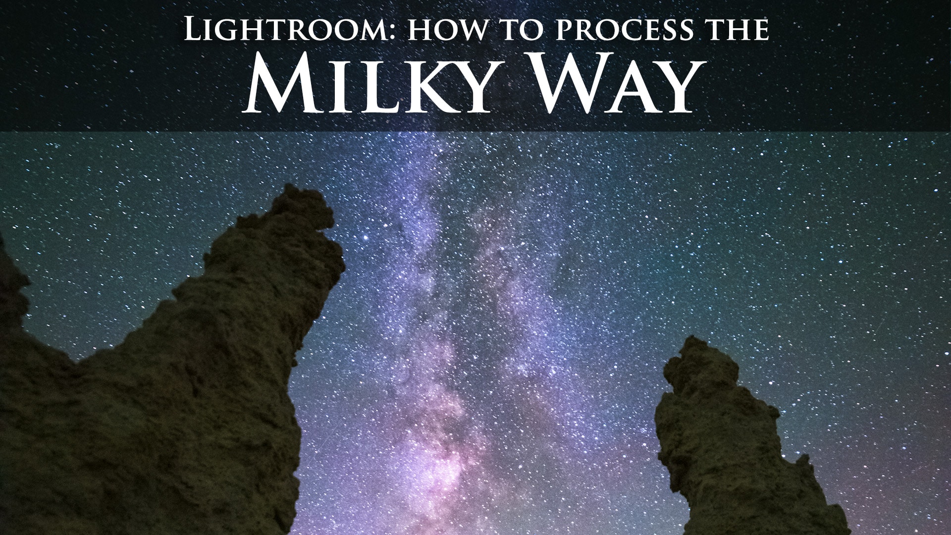
Take your boring Milky Way photo and use post processing to bring it to life in Lightroom or Photoshop’s ACR. Learn the 5 key points
