Learn to create depth and dimension in your photos with textural contrast
How to use light and dark contrasts to make your images stand out.
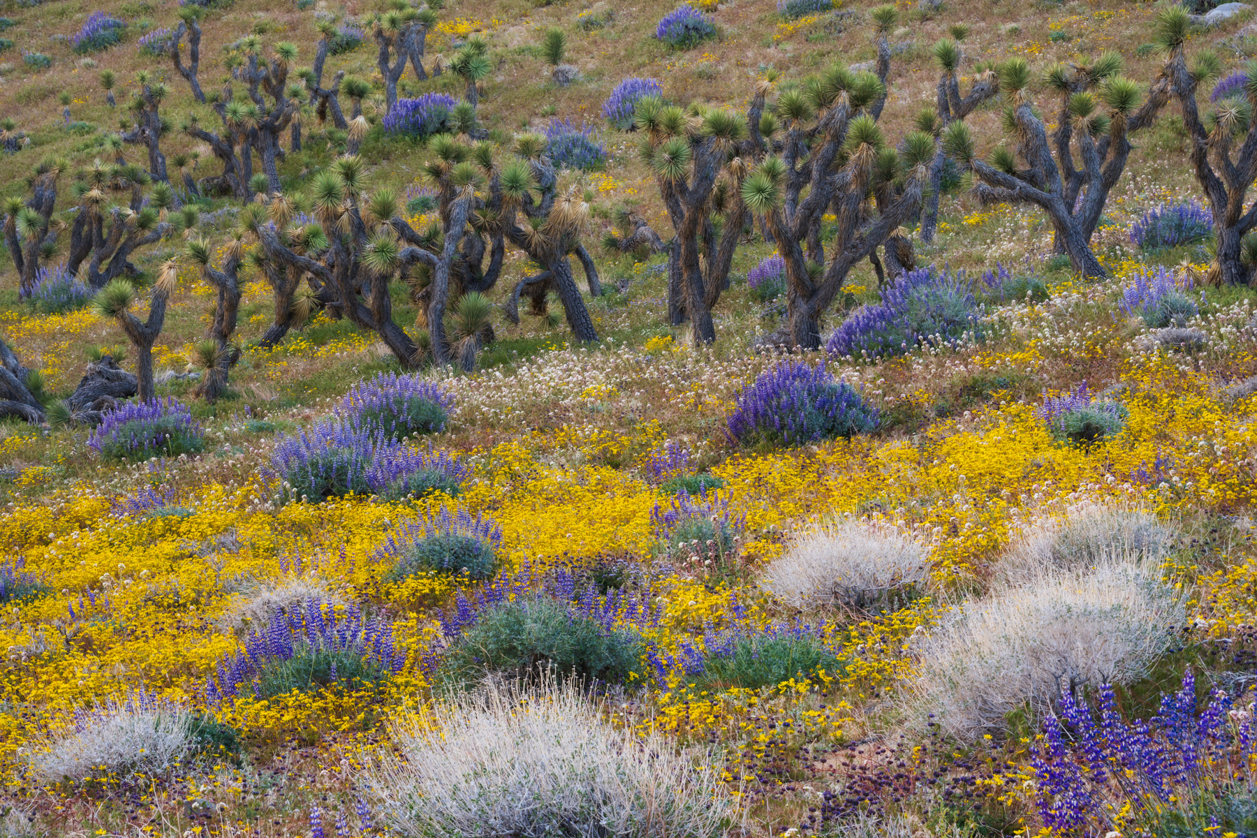
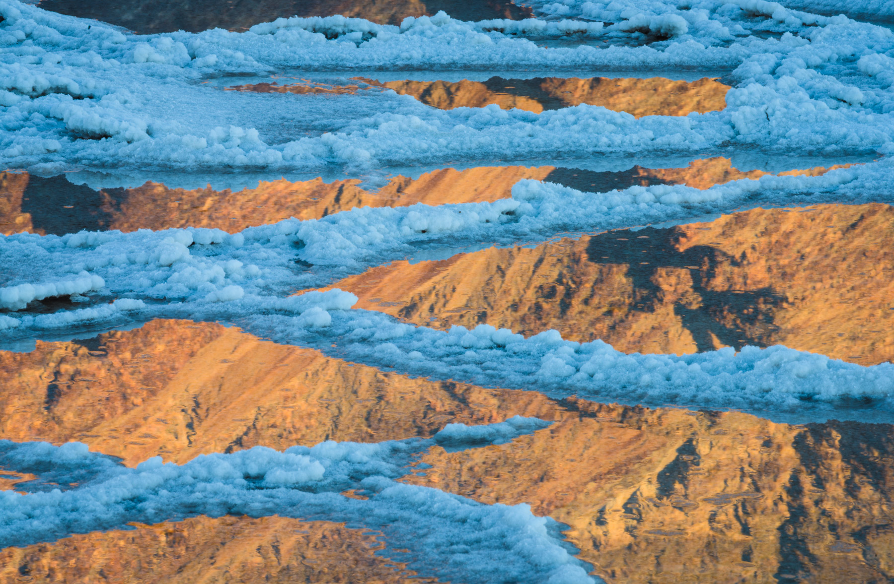
Harness the power of color to help your photos pop
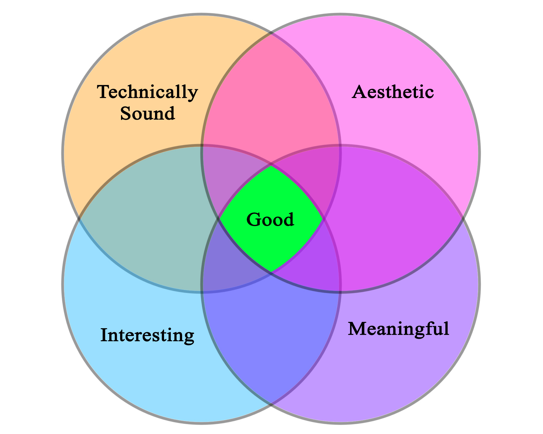
We all want to be good photographers, but have you ever asked yourself, “what makes a good photograph?” I believe that if you want to be good photographer, you should give lots of thought this question.
Probably the most common image quality issue in night photography is noise. Shooting dark scenes at short shutter speeds and high ISOs is a proven
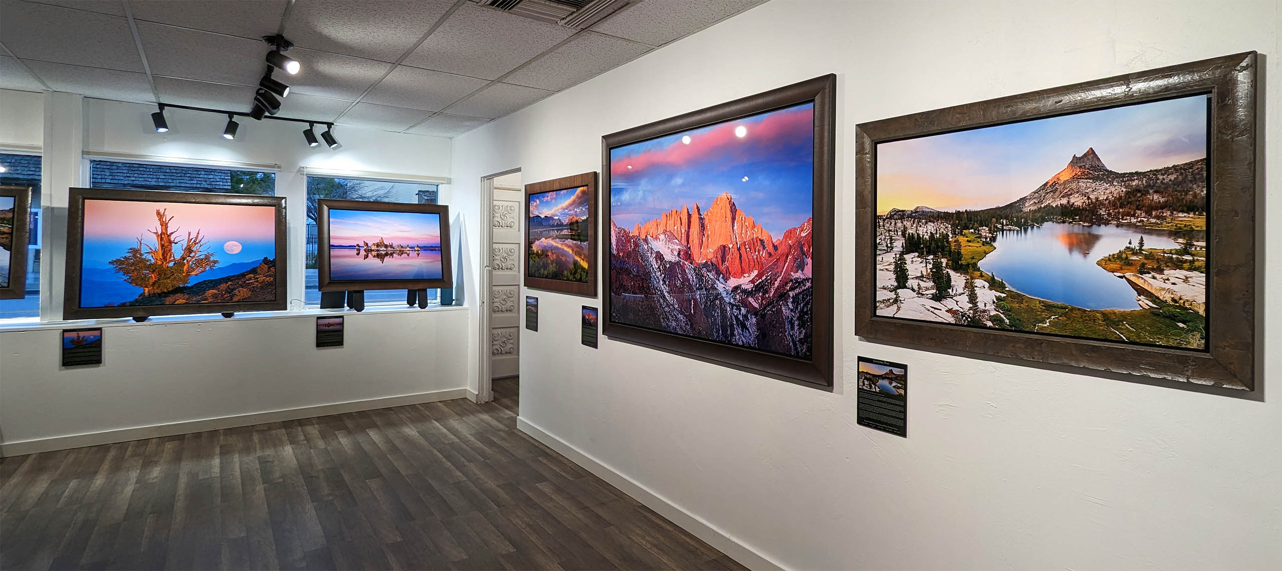
A friend recently said to me that he wasn’t sure how to visit a photography gallery. He doesn’t think of himself as an art collector
In photography it’s easy to focus on the results and to forget about the process. It’s easy to see the pretty picture and not have

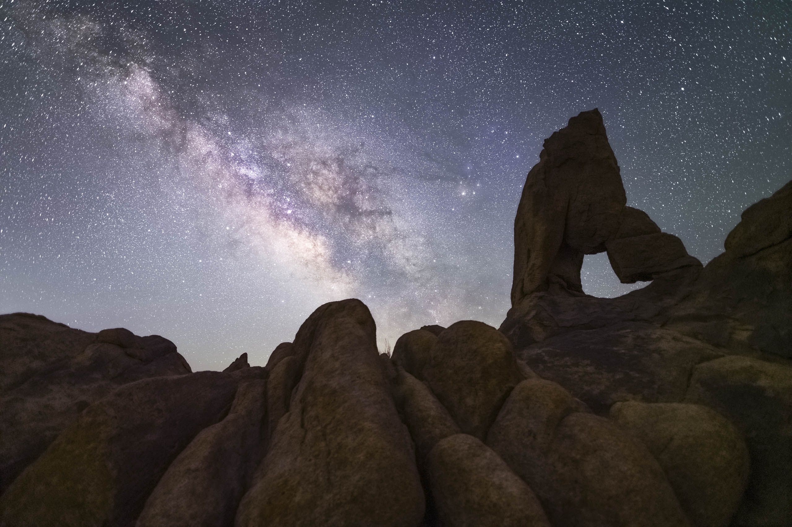
Join me as I scout and scramble around the Alabama Hills in search of a hidden arch.

Watch along as I get creative with tripod placement and explore compositions in order to get the shot I’m hoping for. You can get a
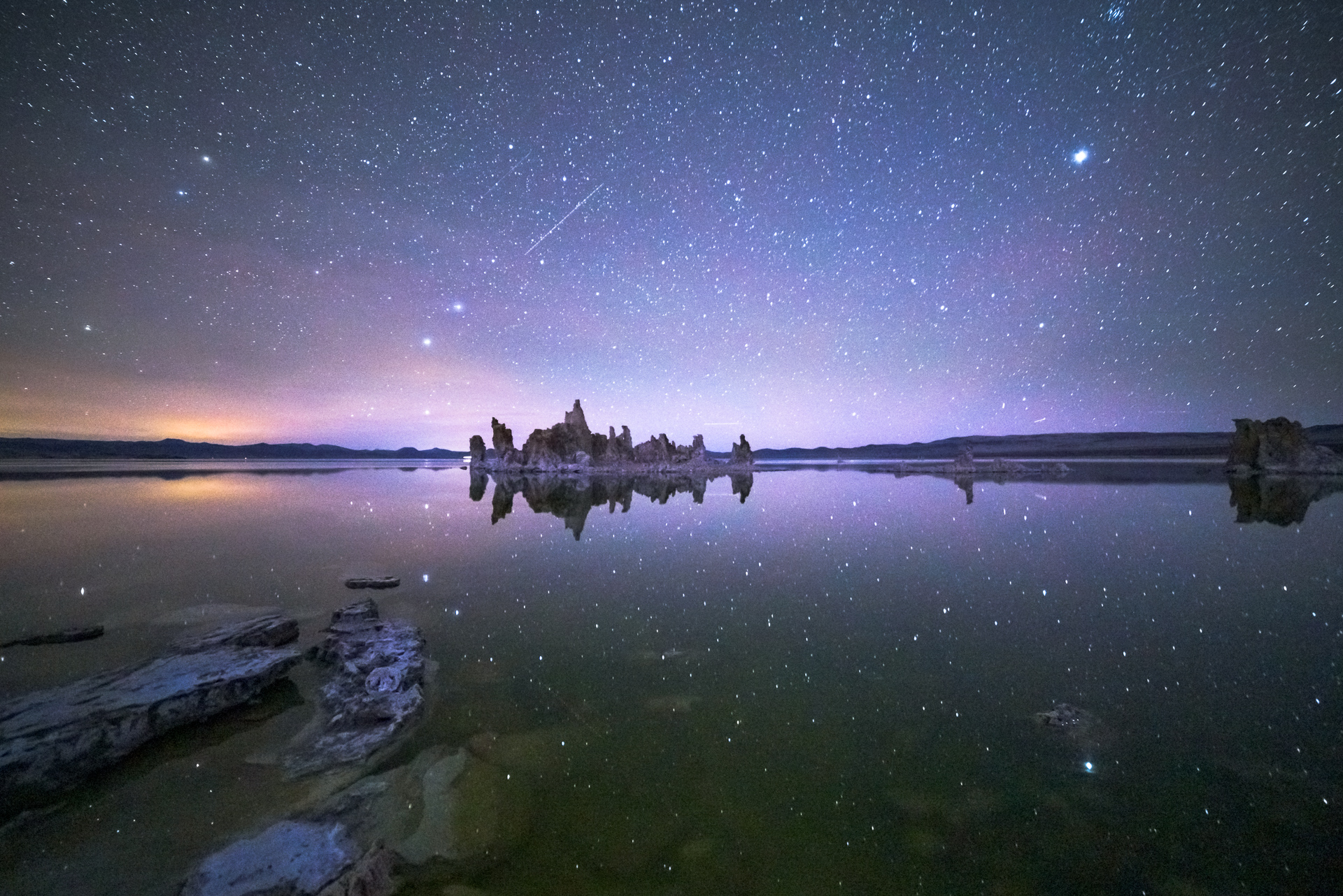
Getting a clear photo of the Milky Way can be a challenge. Once you start shooting it and you expose for the stars you’ll notice
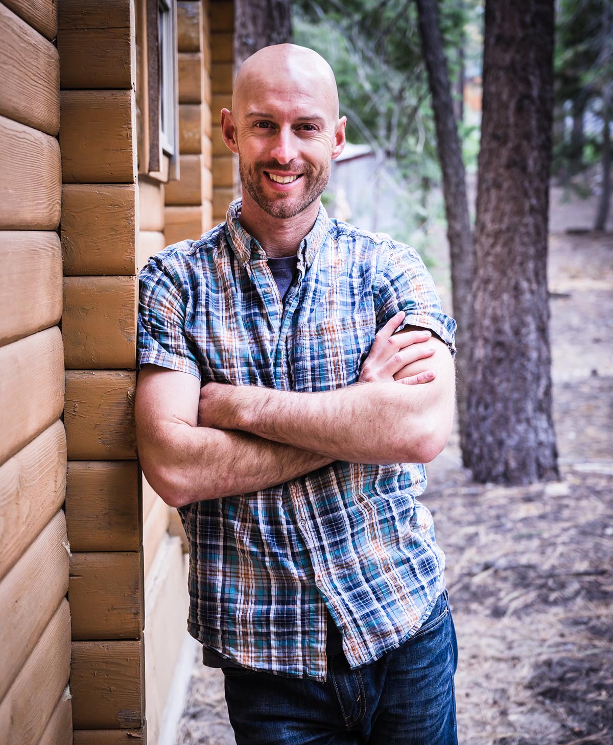
Every time I’ve come close to dying. It’s involved a mountain, a steep slope and a somewhat reckless human. Uh, me, my name is Josh