Hello my excellent friends! It’s Josh Cripps here. Now I like many of you use the Adobe Suite to edit my photos. And in particular, I spend a lot of time in Lightroom. And today I want to share with you four fantastic features that I love about the program that I think you should be using. So let’s go ahead and dive right in.
Keywords
One of the reasons that I like Lightroom so much is not just because it’s a powerful, raw editor, but also because it has fantastic organizational capabilities. And one of the best parts of those organizational capabilities is wording. So if you’re not utilizing keywording, you’re missing out on an amazing way to keep track of your images and find them quickly when you need to. Now, most of the time I do my keywording when I import photos, I tend to import in small batches. So it’s really easy to apply the same keywords to a bunch of photos at once, but you can always do keywording at any time, simply by clicking on a photo or a batch of photos, and then putting in the keywords that you want over here in this keyword area. Now, me personally, the way that I like to do my keywording is I try to include where the photo was taken what’s in the photo, and then anything unique about the photo.
Like if it’s an abstract photo or a long exposure, something like that. So you can see that this photo here from the Alabama Hills I’ve, keyworded it not only with where it is, it’s in California, the Sierra Nevada, and the Alabama Hills, but also what’s in the photo. There’s a lenticular cloud, a specific kind called a Sierra wave cloud and it’s happening at sunset. And so those are the types of things that I typically include in my keywords. You’ll notice that I didn’t put rocks or Rocky formations or pinnacles because in my mind, the Alabama Hills is synonymous with that stuff. And so I, if I’m ever going to be looking for a photo of rocks in the Alabama Hills, it’s kind of a given that searching for Alabama Hills is going to lead to these kinds of photos. Now, if I was shooting, say a big arch, I would put arch in the keywords as well.
Okay. So how does this help me other than being an extraordinarily tedious process and trust me, I know what it is because if you’re out shooting for a long time and you’ve got two weeks of photos to imports and you’ve got to write separate keyword sets for 2000 individual images, it is a pain in the. I realize that, but it’s well worth doing. And the reason is in the future, it makes it so much easier to find any photo that you could ever want to find. So if you’re trying to illustrate something for YouTube, like I do, or if a client asks you for a photo, or if you’re just scratching your head one day going, whatever happened to that time, I shot the Wanaka tree at sunrise and did long exposures there. Well guess what, if you have a robust keywording system, you can really easily find those kinds of photos.
So let me show you an example of exactly how that would work. I’m putting together a video right now about four tips for shooting the full moon. And so I want to gather up as many different kinds of full moon photos as I can. Well, one of the really cool things that you can do with keywording is build out what are called smart collections. And you can see, I actually have a collection here called moon photos. And if you log into it here, you could see that this collection it’s automatically going to pull all the photos from my Lightroom catalog that matched these conditions. So anytime I’ve labeled it with moon and any time I’ve shot a moon photo with my D eight 50. So those it has to match those two things and it’s going to show those particular photos. So in other words, this folder is only going to show me moon photos that I’ve shot with my most current best camera.
And I could adjust this to show me all the moon photos I’ve ever taken. I could adjust it to show me just the full moon photos I’ve ever taken. And to be totally honest with you, this probably needs to be updated. I preach the gospel of the keyword, but I still need to work on it myself. Now, smart collections are great. They get you one step closer to the photos that you want to find. You can see. I have a bunch of them here, like my photos from Columbia and death Valley and photos of my cats, photos from Patagonia, things like that. But what I really love to do with keywording is simply find photos quickly. So say for this video about the full moon that I wanted a demonstration photo from that time that I photograph the full moon rising over mono Lake. Now I could sit here and look through my calendar and try to figure out when the heck I went out there and shot that photo.
Honestly, I don’t remember, or I could do a couple of things. I could simply scroll down here to my Sierra Nevada smart collection. And yes, I keep my mono Lake photos in my Sierra Nevada collection Sue me. So every time I’ve labeled any photo with Sierra boom, it shows up in this catalog from there, you have a lot of other really cool options. And if your keywording is good, you can do a text search within this smart collection. And so I might search for something like a full moon mono Lake and boom. It pulls up all the photos that have that keyword in there. And then I can further refine this search. If I just look for photos that I have edited using this little toggle slider up here, I can find the two photos that I photographed over mono Lake when the full moon is rising over the Lake. So I can really quickly find these photos and then do something with them in my catalog. And that leads me to fantastic feature number two.
And you want to use them in a couple of different ways. Maybe you want to export them for video, or maybe you want to send them to Instagram or Facebook, or you may be want to make a print out of them. And all of those different use cases are going to require different kinds of settings, right? For your website or for a presentation. You might want to do a more compressed version of the photo that doesn’t take up that much space, but for print, you might want to export it to a full 16 bit TIF with no compression for the maximum image quality. And when you go to export and you can get to the export dialogue box, a couple of different ways, you can go up here to file export. You can right click on the photo and then scroll down to export.
Or you can do what I like to do is use keyboard shortcuts. In this case for windows it’s control shift E for Mac, that would be command shifty. And it brings up this dialog box. Let me scrunch this down so you can actually see it. And over here on the right, you have all kinds of different options from where you want to store these exported files, how you want to rename them. If you want to adjust the file compression, if it’s, if you want it to be a JPEG or a PSD or a TIF, what kind of color space, the size of the image and on and on all the way down through watermarking here. Now, if you have four different use cases that you’re going to put this same image into you, don’t want to have to re input those settings differently every single time.
So you can make these export presets and the way you do it. Oh gosh. It is so simple. You basically plug in the settings that you want. Like for Instagram, I know that Instagram likes photos that are 10 80 pixels wide. It doesn’t need to be a hundred percent quality. It could be like 80 something percent quality. That’s fine. So I like to put this in my, my pictures folder and I’ll put it in a sub folder called Instagram. There we go. And I don’t need to rename it. You could always add a suffix like Instagram to the file name if you want it to, uh, the compression settings there. Okay. That’s okay. I’m going to sharpen a little bit for the screen. And I also want to add a watermark. Now you can go in here and you can create custom watermarks. And there’s, I have a video about how to do that on this channel.
I’ll link it up there. Uh, and I just have this basic watermark with my logo in it. And after export, we can go ahead and in this case, we’ll have it, show it in explore. So it’s just going to open the folder for us. And so if I do all of this work, and then I changed these export settings, I’ve lost this preset. So what I can do with all of these things set here before I hit export is I can go ahead and over here on this button, click add, and that’s going to bring up this dialog box and I can call it something Instagram and click create. It’s going to save it under my user presets. I already have an Instagram preset, but I just wanted to make another one for you guys for the purposes of this video. So now I can even cancel out of this or I can change the settings completely.
Uh, like let me take a quick look at the settings that I use. When I export for YouTube. I put it in my videos folder under a sub folder called 2020, export it at 25 60 pixels. And I don’t put a watermark on there. So let’s go ahead and say that I export this photo it’s working right now. We’re actually exporting both because I had them both selected. Okay. And there it’s done. And you can see that it has gone ahead and export of that photo of both of those photos right here, where I wanted them using the settings that I wanted. That’s great. Now I want to export these and upload them to Instagram. Well, I don’t want to have to go back in here and change all of these settings back, but the cool thing is I really don’t have to, I can just click right here on that Instagram preset and it, boom, it smacks everything back where it needs to go.
And sure enough, as I export it, you’re going to see boom. There it is. It brings it up in that pictures folder that I wanted under Instagram. It put the watermark on there, put my logo on there with the right dimensions and compression that I wanted for that image. So you can create all of these presets for all of the different uses that you use for your image for. You can see I’ve got one for Facebook, Instagram, when I’m doing presentations, when I’m making prints, the ones I put on my website, the ones that I do for YouTube, or when I’m putting a really big image on YouTube. So I’ve got all these presets and you can actually have Lightroom export all of these things simultaneously. You can just click the boxes that you want hit batch export. It brings up this little guy asking you, if you want to save all the images in the same folder, I don’t check this. I just leave it as is. And I hit export. And it does all of that stuff for me automatically. The images are exactly where I expect them with the dimensions and the quality and the watermark and the sharpening and all that stuff that I’ve plugged in there. So that’s why I love export presets because I do these things so many times. It’s really great to have these one click and done solutions.
Talk about a couple of the features that I use for my actual editing. And one of my favorite tools within all of Lightroom is something called the targeted adjustment tool. I recently posted a video about how I took this photo in one of the questions I got in the comments was how do I know where to place these control points within the curve to get the look that I want? And the truth is, I don’t know exactly. Let me get rid of these and I’ll show you how I do it. Now you can make some educated guesses because it does show you the histogram here. So I can guess that this is probably where the highlights are on the curve, and this is probably where the shadows are. And if I adjust from that point, I can make a pretty good curve that I want to see, but there’s an easier way to do it, which is to come up here to this little circle and click on that.
This is the targeted adjustment tool. And any time you hover this over the image, you’re going to see I’ll put my mouse over here. So you guys can see both things at once. When I hover it over the lighter parts, it draws a control point on the curve. And if I move it down towards the darker points, it shows you where that point lies on the curve. So if I know that I want the highlights in this image, brighter in the shadows, a little bit darker. All I have to do is click and drag on the image itself, where I want to place a control point on the curve and the targeted adjustment tool does that automatically. So if I want the highlights brighter, I click and drag on the highlights on the image. I’m going to click and drag up just like that. And you can see it’s automatically placing a control point and moving the curve up.
Now I just move over to the shadows. I click and drag down and it automatically places that control point there, and you can place as many control points using the targeted adjustment tool as you want. So if you think this part of the photo is getting a little bit too dark, we’ll just click and drag up a tiny bit there. And you see it’s going to place that third control point and pull those shadows slightly back up. So you can do this on any image. It’s such an easy way to adjust the contrast and dynamic range within the photo, simply by clicking on the parts that you want, brighter dragging them up and clicking on the parts that you want darker and dragging them down. Now the targeted adjustment tool has another use case, which is adjusting color. So just below the tone curve is the HSL panel.
And for this one, I’m going to need a more colorful image. So let’s do the magic of video editing. Cool. Now we’ve got here an image that has pretty much every different color in the spectrum within the photo. Now say you want to make it a little bit more colorful, but only in the magenta. So if you go up here to that basic tab and you just increase the saturation, everything is going to become more saturated and maybe the Magento’s look good, but God, these yellows right here look like puke. And those blues are looking way too funky. So how do we adjust just the magenta? Well, hopefully you guys know that you can use something called this HSL panel, which allows you to make adjustments within each color range. So you can change the hue itself. If you want the oranges to be more red, that’s fine.
You can just slide this slide or this way, if you want the blues to be more purple-y, you can slide this slider this way. If you want the, say the greens to be brighter, you can play with the luminance of each channel right here as well. Now, the tricky thing with color is that what you see with your eye, isn’t always where the color lies on the color wheel. And this is very common with yellows and greens. You think something is obviously green, uh, but it turns out it actually lies in the yellow channel. So how do you know where to make these adjustments? We’ll again, you can use the targeted adjustment tool. So you click on this little circular dot dude and then whatever color you want to be more saturated. Say, I did want those blues to be more saturated. I could click and drag up on them.
Lightroom automatically selects the appropriate color range, where you select and makes the adjustment that you want without affecting any of the other color ranges. So if I wanted the blues a little more saturated, great, I’ve got it. Say, I want these yellows to be a little bit more de-saturated now to me, they look like yellow, but you can see that light room over here on the right is putting them in the orange channel. So I’m actually, de-saturated the oranges and that’s fine. I just want to work visually. I’ll let Lightroom do all the math and crazy calculations it needs to do. I’m just going to use the targeted adjustment tool to make the colors that I want more saturated by clicking and dragging up and de saturating the ones I don’t want as much by clicking and dragging down. So you can use the tat the tap, the targeted adjustment tool to make these really easy, intuitive adjustments. So I hope that’s something that you can bring in yeah.
And the final thing that I wanted to talk about in this video that I think you should be using in your editing is virtual copies. Say you got a photo like this, and you liked the way that you’ve processed it, but you come back a couple of weeks later, you look at it again and you go, I wonder if that would look better in black and white, or I wonder if it would look better if I processed it really dark and moody and dramatic will you certainly could bring the image into the develop module and you could undo all of the adjustments that you’ve made and said, okay, let’s change this and make it black and white. And let’s readjust the exposure to get something that looks good. And now we’re going to have to readjust the clarity and detail settings we’re going to have to make completely different tone curve adjustments.
All right. Let’s see. Uh, okay. Do I like this? Do I remember what the color copy even looked like? How can I compare the two? Well, one really easy way to do that is by creating virtual copies. So let me back up here. Boom. And I’m going to go ahead and right click on the photo and scroll down to create virtual copy and what this does. If I go back to my grid view here is it simply makes an identical copy of the photo and you can make adjustments to that second copy without altering anything of the first copy. So now that I have this virtual copy here, I can go ahead and develop this one to my heart’s content. Let’s say we want to do a dark dramatic kind of processing here. So I’m going to pull my whites up, pull my highlights up.
Uh, I mean, uh, those are the highlights. That’s what those are called. And I think we’re getting a little bit oversaturated with those colors. So I’ll drop that down a little bit. Maybe I want to add a little grad filter action down here on the bottom to bring some of that detail back in. Hey, that’s kinda cool. That’s looking okay. And if I go back to my grid view, now you can see I’ve got these two different copies of the image that I can bring up. I can compare side by side to see which one I like or I can even export both of these using an export preset to put in a video very much like this one, where I can make before and afters really, really simply. You can also use virtual copies to create raw before and afters. For example, this photo right here.
If I create a virtual copy, I can simply right click on this virtual copy, scroll down here to develop settings and click reset. And it’s going to show me the raw file. So now if I ever want to, for a video do a before and after comparison, I can export the virtual copy and the developed copy. And I don’t have to worry about the adjustments from one accidentally affecting the other, another really useful application for virtual copies is cropping. If you’re like me, you like to shoot a lot of vertical photos, but you probably aware that full two by three vertical aspect ratio doesn’t play well with Instagram. So what you can do rather than cropping your original image and kind of forgetting what it looks like as a whole is you can make a virtual copy and then you can apply a crop just to that virtual copy.
I’ll do a four by five, which is the Instagram crop. And I can just this crop until I think it looks good. Boom. Now I have an Instagram ready version that I can export using my Instagram preset and it hasn’t affected my original version. So I still have both of these photos. I can export the full version for say prints or for my website. And I can export this crop version for Instagram or Facebook. And you can do this for video. You can crop into a 16 by nine, whatever the case may be. And because you’re not actually duplicating the image file, you’re just creating this virtual copy. It doesn’t really take any more storage space. So you can make as many of these as you want for all the different ways that you can think about using an image. So I love virtual copies and I hope that you guys can use them as well. That’s going to wrap up this video for fantastic features in Lightroom that I think you should be using to improve your workflow. If you found any of these features helpful, let me know down in the comments, which one you liked most and how you think you’re going to use it going forward. Thank you guys so much for watching these videos. I really do appreciate the support and I love the interaction in the community here on YouTube. I’ll see you soon in another video until next time have fun and happy shooting.
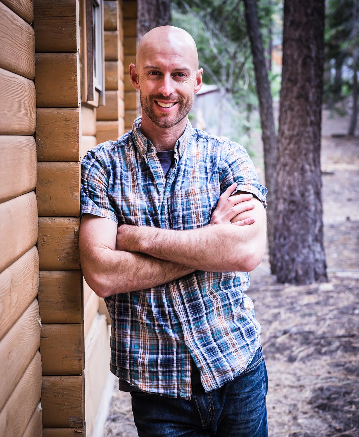
Joshua Cripps is a renowned landscape photographer who has garnered worldwide acclaim for his breathtaking images of our planet’s wild places. His photos have been published by the likes of National Geographic, NASA, CNN, BBC, and Nikon Global.
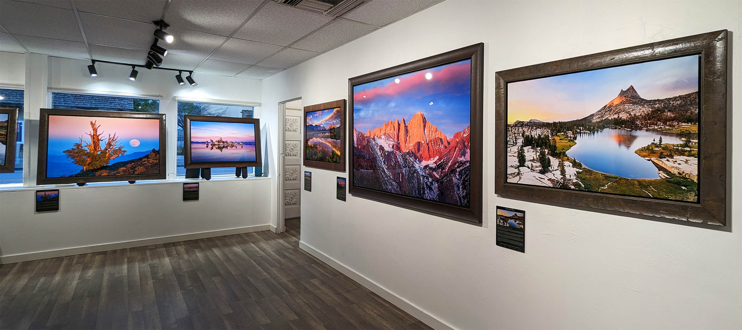
The Mount Whitney Gallery was founded in 2023 by Joshua Cripps as a way to share his passion stunning landscapes of the Sierra Nevada and beyond.
Set at the foot of the breathtaking Sierra with a view of the range’s highest peaks, the gallery features large format, museum-caliber fine art prints of Josh’s signature photographs.
Course Login | Results Disclaimer | Terms and Conditions | Privacy Policy
© Copyright – Joshua Cripps Photography