
If you’ve ever taken a statistics class you surely now have an innate phobia of histograms. But fear not, because this article is not a math pop quiz, and your camera’s histogram is not intended to give you cold sweats. Nay, it’s simply a tool to help you determine whether or not your photo is exposed well.
First things first, let me make a little disclaimer: The purpose of this article is to help you understand in a practical sense what the histogram on your camera is and what it’s used for. Because of that, and since I don’t think it’s important to get bogged down in the nitty gritty minutiae of the subject, when I say “The Histogram” I’m very generically referring to the white histogram which your camera displays during playback.
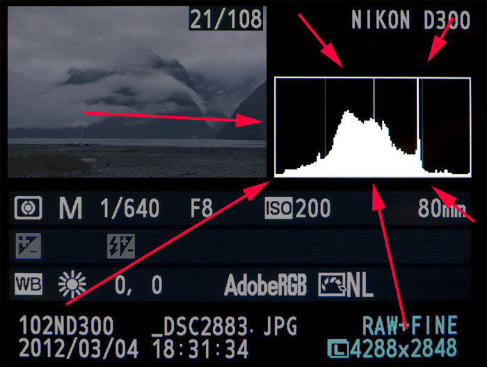
Yup, that thing, right there
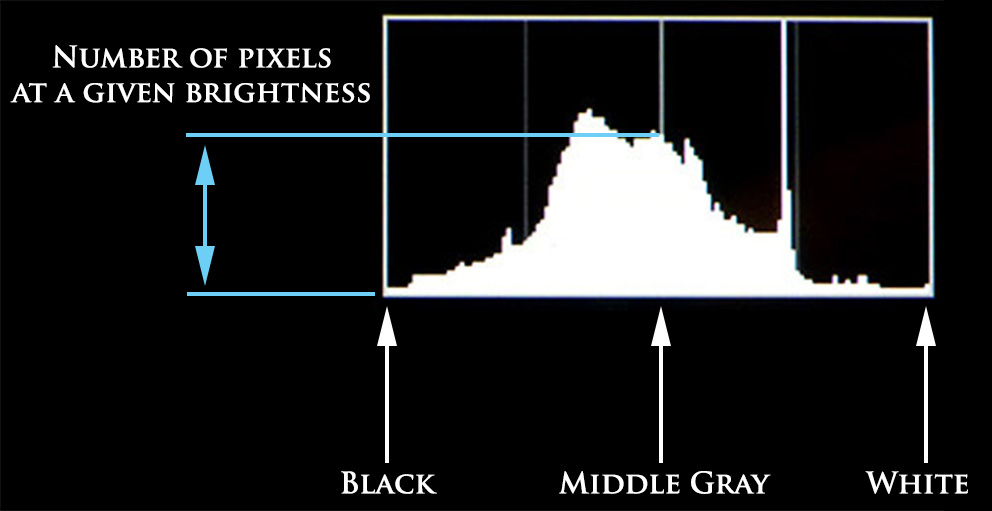
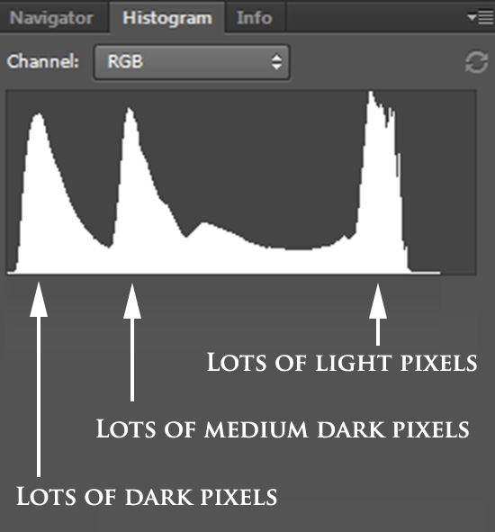
So that white histogram, what that is, is your camera’s best guess of all the brightness values in your photo. Here’s what it displays: the horizontal axis of the histogram shows all the brightness values in your photo, from Black all the way on the left, to Middle Gray in the dead center, to White on the far right. And the vertical axis of your histogram represents how many pixels have that particular brightness value. In other words, the more pixels you have at a certain brightness value in your photo, the bigger the corresponding spike on the histogram will be.
Let’s take a look at a specific example to see if we can understand what’s going on. Here’s a middle gray image, exciting:

Are you not entertained???
Every single one of the pixels in this image are middle gray. There is no black, no white, and nothing else except middle gray. So when we look at the histogram for this photo we should expect to see a spike of pixels in the dead center, and nothing else. Indeed, that’s what Photoshop shows us as the histogram, a spike right in the middle:
 Similarly, if this was a pure black image we’d see a single spike all the way on the left hand side of the histogram, and if it were pure white we’d see a spike all the way on the right. But let’s skip past those examples to something a little more interesting. Here’s a photo of some trees and mountains on a very gray day.
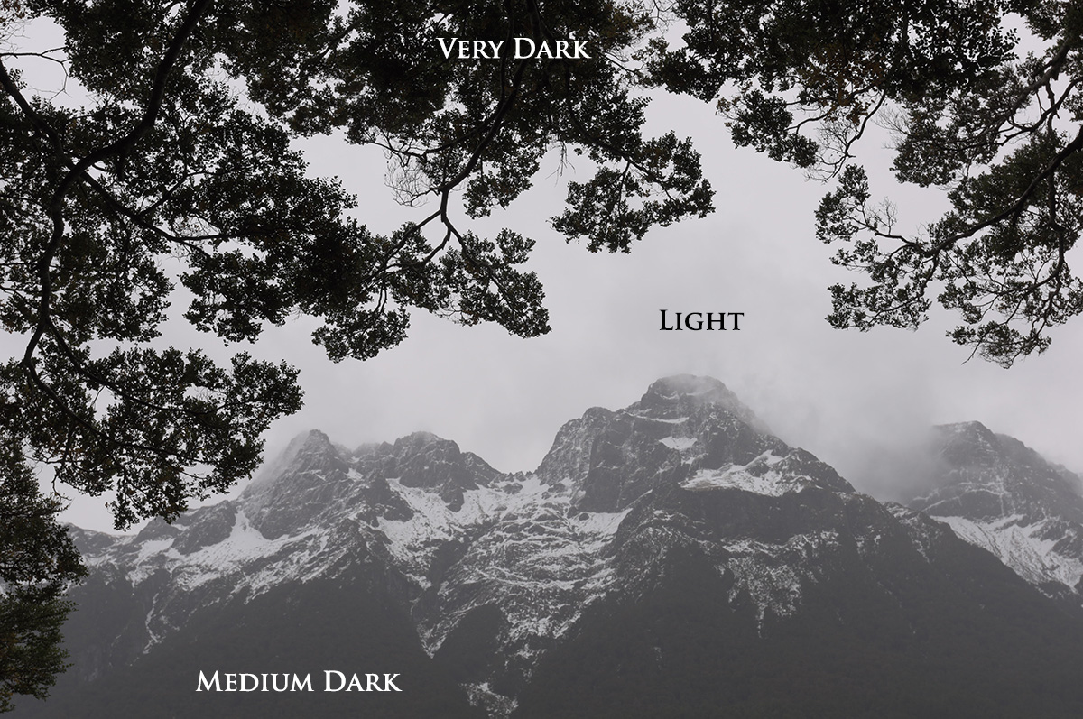
As you can see there are three very distinct tonal regions in the image: very dark areas in the tree branches, mildly dark areas in the mountains, and lighter areas in the sky. In other words, there are lots of very dark pixels, lots of medium dark pixels, lots of light pixels, and not a lot of anything else. So looking at a histogram of this image we should expect to see three large spikes, representing those individual tonal regions, and indeed we do!
Well this is all very interesting, professor, but what do I do with this information? I’m so glad you asked! Since we now understand that a histogram is your camera’s way of representing all the brightness values in your image, you can use it to find out if you have any clipped shadows or clipped highlights. In other words, the histogram tells you if your photo is under-exposed, over exposed, and if you’ve lost image data from clipping.
Ha, just kidding! It’s a myth that there is such a thing as a perfect histogram. However, there are a few standard guidelines you can follow to make sure yours is as good as possible.
As you can see, the histogram is an amazing tool for digital photographers trying to perfect their exposures.
Now that I’ve just spent the past few minutes telling you how the histogram is the greatest thing since sliced bread I get to tell you that it’s actually not completely accurate, oops. You see, your camera’s histogram is not based on your raw photo data, but rather on an 8-bit jpeg version of your photo, using whatever picture control/style you have dialed in (Landscape, Portrait, Vivid, Neutral, etc). Since these picture controls can add saturation, contrast, and other effects to your images it means that the histogram your camera is showing you doesn’t represent the actual raw photo data. So in order to see the absolute most accurate representation of your raw file you should use a picture control/style that has as little contrast/saturation/clarity/sharpness added as possible.
Additionally, the histogram that we’ve been talking about also doesn’t necessarily show if you have any clipping in your individual color channels. So in order to fully, and pedantically, make the most of your histogram and understand completely what it’s telling you, you should also review your individual Red, Green, and Blue histograms to make sure you’re not clipping that data as well.
So that’s the histogram in a nutshell. Learn to understand what it’s saying and it’ll be your new best friend. Because who needs actual human friends when you have data to analyze?
If you’d like to understand even more about the histogram, I’d check out these detailed articles. In them you’ll find comprehensive discussions of the different kinds of histograms (RGB vs. Luminosity), how they’re formed from the individual color channel information, and how color affects luminosity. This information won’t necessarily make you a better photographer, but it will make your head spin! 🙂
http://www.cambridgeincolour.com/tutorials/histograms2.htm
http://www.scantips.com/lights/histograms.html
http://www.diyfilm.co.uk/white-balancing-with-your-histogram/


5 Responses
Short, sharpe snippets of information. Just enough to wet your tastebuds and hungry for more! Brilliant josh- keep em coming!????
Thanks, Ann! More on the way!
One of the only articles on Histograms I actually have no quibbles with. Clean concise and accurate
Phew! Quibble-free is what I’m going for. 🙂
If simplicity is the essence of education, then you. . . nailed it. A complete understanding to get anyone started and to stop being afraid of the rocket science, ( E=MC2 ) in camera use and abuse. As a new member I think I am about to begin a journey of enlightenment. This article on the histogram enable me to learn that 18% actually represents the centre of the graph, wow. You see, I learnt that the graph is divided into 1 > 255 parts, black to white therefore, the centre is 127, “simple” as the Meerkat would say. Now, how is it that I have to introduce percentages to this graph, and an arbitrary figure such as 18, dah! I’m a photographer for goodness sake. Now when I use a piece of plastic in my scene, called a grey card (18% grey), I now know that represents the middle of my histogram. In Photoshop I click on this grey card and it apparently centralizes my graph; simple I squeak, wided eyed. . . or am I still getting this wrong? Grief! perhaps I should have taken up bingo as a hobby.