Digital imaging and software packages like Photoshop have led to a groundbreaking revolution in composite photography. I love compositing because it frees you up creatively. There are no limits to the images you can create. Dangerous and fantastical adventures, underwater worlds, and magical moments. Nothing is out of bounds, and the only things limiting the images you can achieve are your creativity and your Photoshop skillz. I’ve been getting more into composites lately so I thought I would spruce up a self portrait I took in the summer of 2011 by adding a gritty background to it.
When shooting portraits with artificial lights I love a three-light setup with the key light being a large, somewhat soft light on-axis with the subject, and two harder lights behind the subject and high up left and right in order to provide a cool rim light for the portrait. This setup creates a punchy, almost 3D look that is really cool. Here’s a shot showing the basic lighting setup:

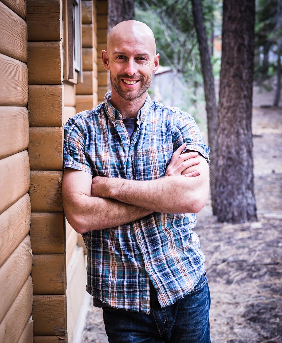
You can see in this shot that I used a fourth light directly behind me for some additional separation from the background. I like this look even more than the 3 light setup, but here I ultimately decided to nix the separation light simply because my background was too cluttered. So after ditching this light and getting my pose down, here’s the straight-out-of-camera version of my final portrait:

When I originally processed this image I wanted to make a complete joke of the tough guy look so I added some cartoon tattoos. You’ll also noticed that I ditched the background completely.

But like I said, I’ve been improving my compositing skills, as well as realizing that a good background really makes or breaks an image, so I wanted to re-process the shot and composite it into a background. I wanted something a little grungy and urban so I used this shot of an alley in downtown Santa Cruz.

My portrait was fairly easy to cut out cleanly in Photoshop because it was simply on a dark background, so I moved the alley background behind the cutout portrait and free transformed it until the perspective matched.

Then to get the two images to blend together smoothly I adjusted the hue and saturation of each, added some noise to the image, and used a gradient map to further match the colors. There was also quite a bit of dodging and burning I did to help stylize the image. And voila, the final result:

Looking for images like this? Contact me for a portrait session.
Or if you want to improve your own composite skills, check out the awesome tutorials from the ever-inspiring Aaron Nace over at Phlearn. I also recommend the book Photoshop Compositing Secrets by Matt Kloskowski.