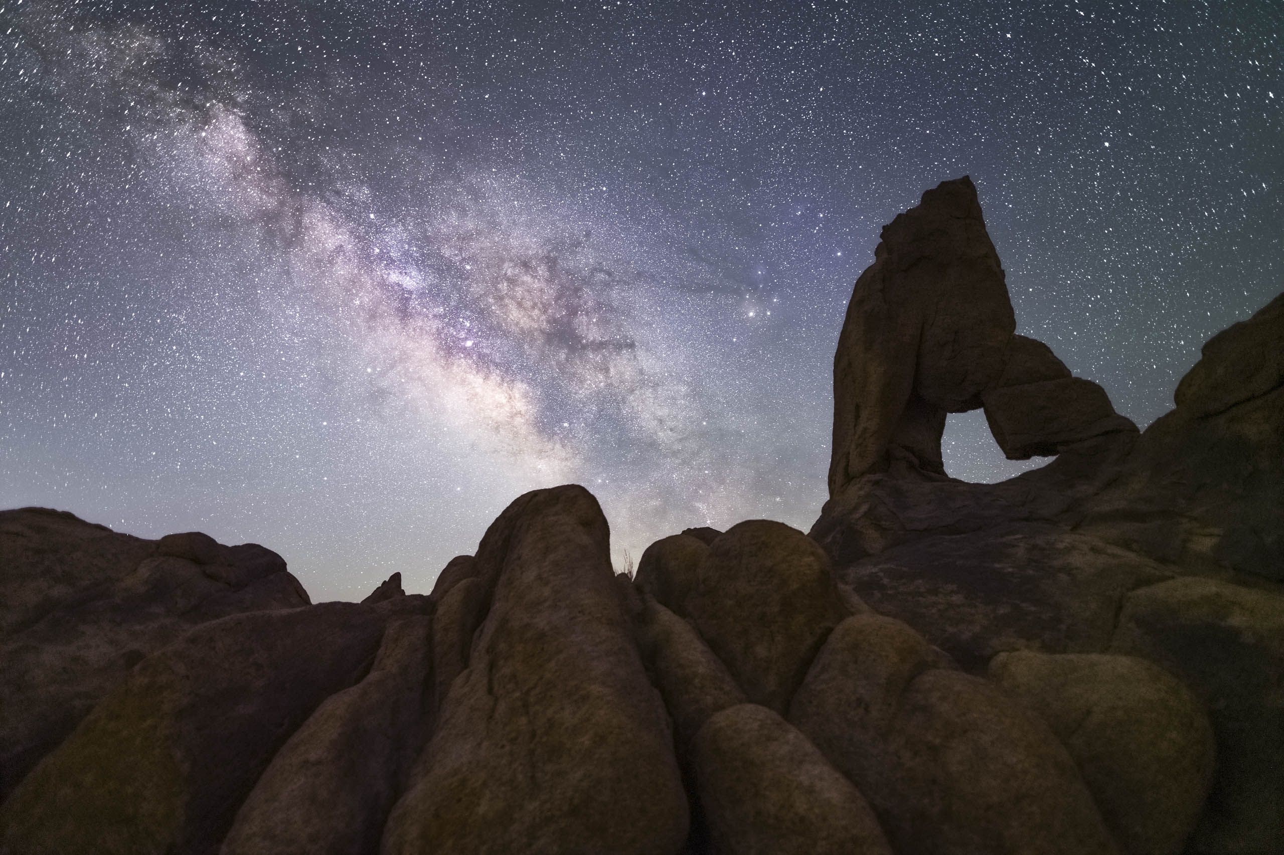
Nice video. I think people forget about texture contrasts a lot both when they are taking the photo but also when editing the photo in post-processing. Good reminder, and definitely an element to keep in mind for getting the maximum beauty out of your shots.
I really appreciate the comments, and actually I did consider some of those ideas somewhat, but kind of stopped short. however, the next time I am at the Wedge where that lone tree is I am going to use your comments to get some different shots. Thanks again!!
This website uses cookies to provide the best experience. You can adjust your settings here. Cookie settingsACCEPTRead More
Privacy & Cookies Policy
Privacy Overview
This website uses cookies to improve your experience while you navigate through the website. Out of these cookies, the cookies that are categorized as necessary are stored on your browser as they are essential for the working of basic functionalities of the website. We also use third-party cookies that help us analyze and understand how you use this website. These cookies will be stored in your browser only with your consent. You also have the option to opt-out of these cookies. But opting out of some of these cookies may have an effect on your browsing experience.
Necessary cookies are absolutely essential for the website to function properly. This category only includes cookies that ensures basic functionalities and security features of the website. These cookies do not store any personal information.
Any cookies that may not be particularly necessary for the website to function and is used specifically to collect user personal data via analytics, ads, other embedded contents are termed as non-necessary cookies. It is mandatory to procure user consent prior to running these cookies on your website.
Thanks for your order. Please wait a moment while we process your payment.


2 Responses
Nice video. I think people forget about texture contrasts a lot both when they are taking the photo but also when editing the photo in post-processing. Good reminder, and definitely an element to keep in mind for getting the maximum beauty out of your shots.
I really appreciate the comments, and actually I did consider some of those ideas somewhat, but kind of stopped short. however, the next time I am at the Wedge where that lone tree is I am going to use your comments to get some different shots. Thanks again!!